Apple Music X Apple Intelligence
(GenAI Exploration, not directly affiliated with Apple)
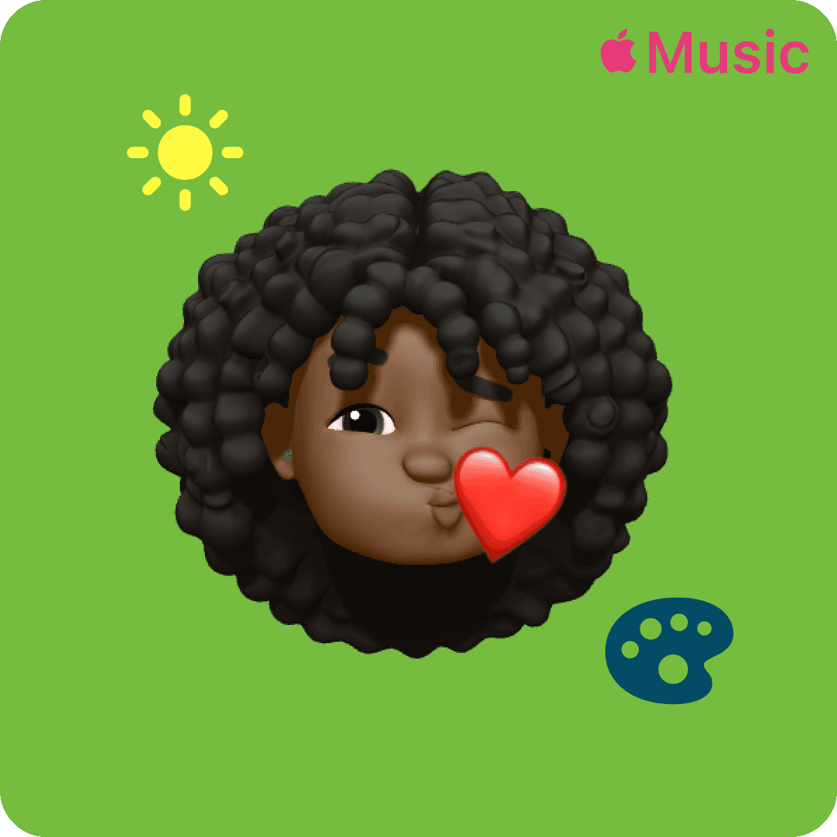
What if your playlist could see itself?
Introducing an AI artwork system that understands your music — not just your first song.
Role
UX Research, Design, Interviews, Product Design, Prototyping
Type
Product Concept
Focus
Personalization, AI, Visual Identity
The evolution
A decade of covers. One missing piece.
Since 2015, Apple Music has quietly reinvented how playlists look. Black-and-white simplicity gave way to geometric designs that pulled color from your first song's artwork.
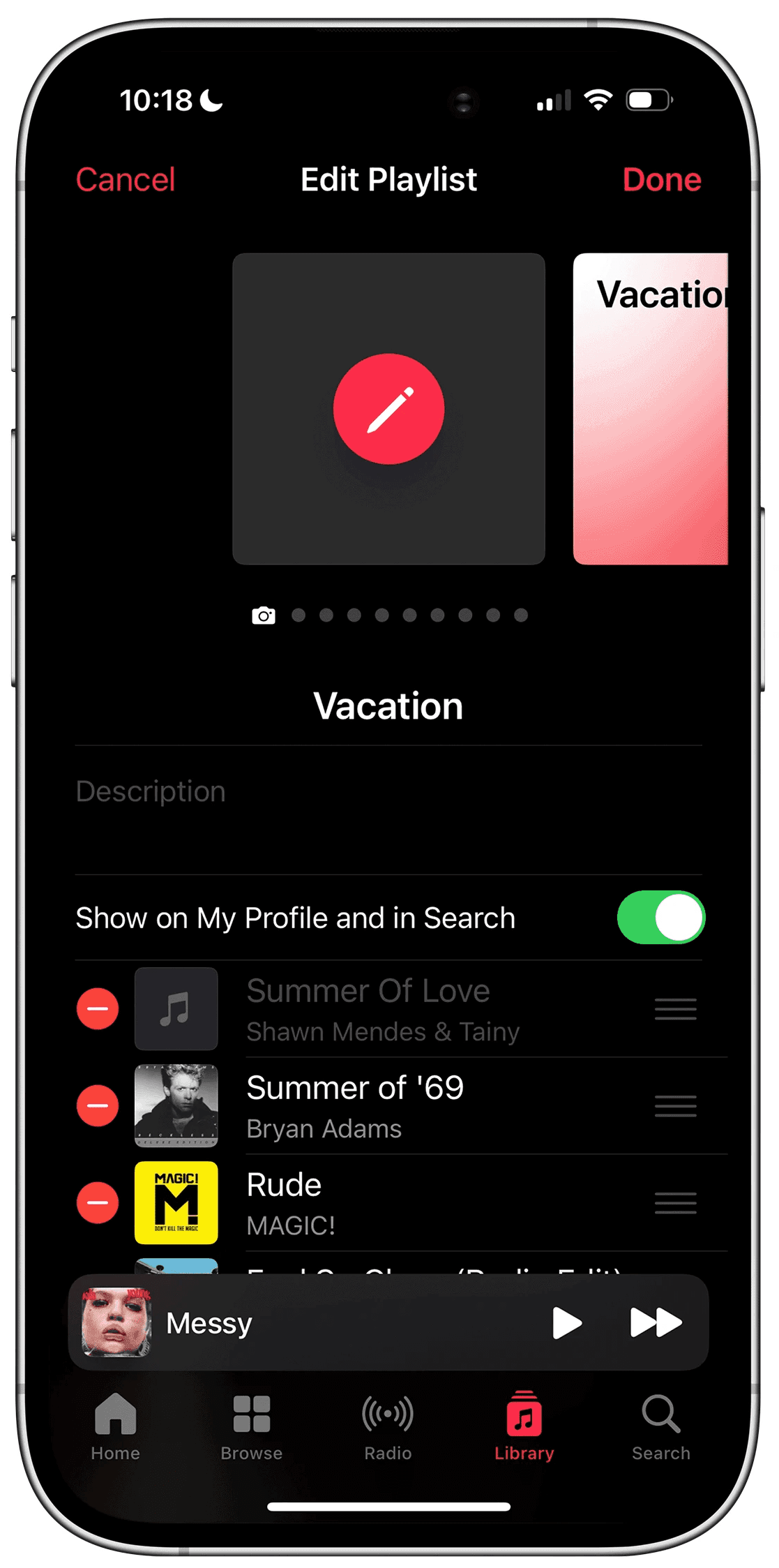
Some users loved the gradients. Others missed the 2×2 album grid, something personal. Something theirs.
The problem
iOS 17.1 gave us beautiful covers.
It took away something, too.
The 2×2 grid is gone. And with it, a sense of control. Artwork now reflects the first song — not the feeling of the whole playlist. Creativity has limits. Users don't.
Artwork today reflects one song. It should reflect a whole feeling.


The magic moment
Picture this.
You build a playlist for your solo drive, songs that feel like late autumn, windows down, nothing urgent.
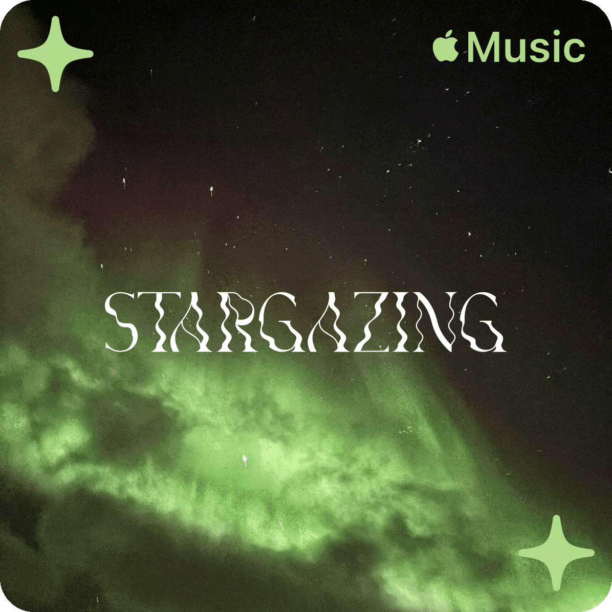
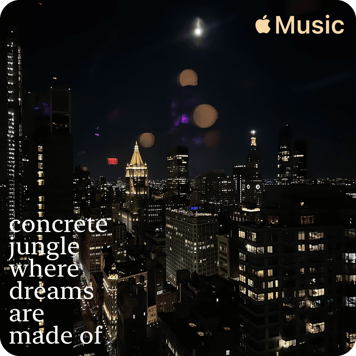
You hit save. And instead of a generic gradient, the cover that appears back at you is exactly what that drive feels like, muted tones, soft geometry, something almost cinematic.
You didn't design it. But it's unmistakably yours.
That feeling, of being seen by your own music library, is the emotional core of this project.
The solution
An AI that understands music. Not just metadata.
This system analyzes your entire playlist — the mood arc, the genre shifts, the cultural weight of the artists. Then it generates artwork that's culturally resonant, visually stunning, and unmistakably Apple.
Design principles
What makes Apple, Apple?
Before a single pixel was placed, we returned to the source: Apple's Human Interface Guidelines. Clarity. Consistency. Minimalism. Emotional resonance. Every decision was held against these principles.
Three features
One vision. Three expressions.
Before a single pixel was placed, we returned to the source: Apple's Human Interface Guidelines. Clarity. Consistency. Minimalism. Emotional resonance. Every decision was held against these principles.
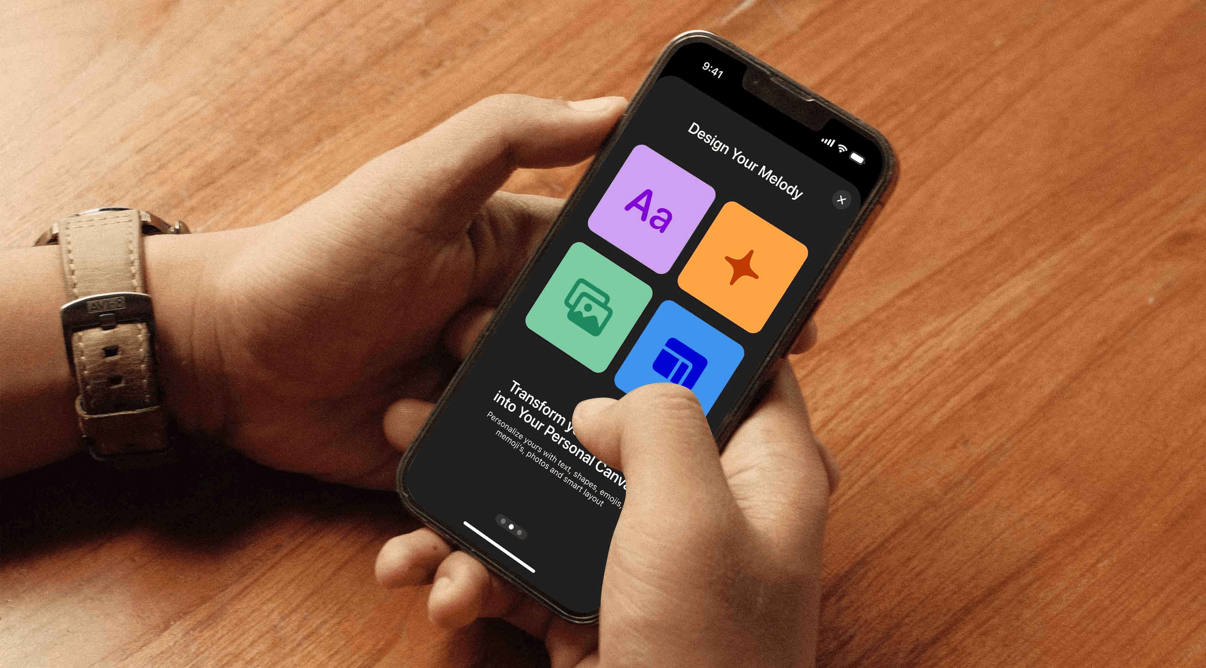
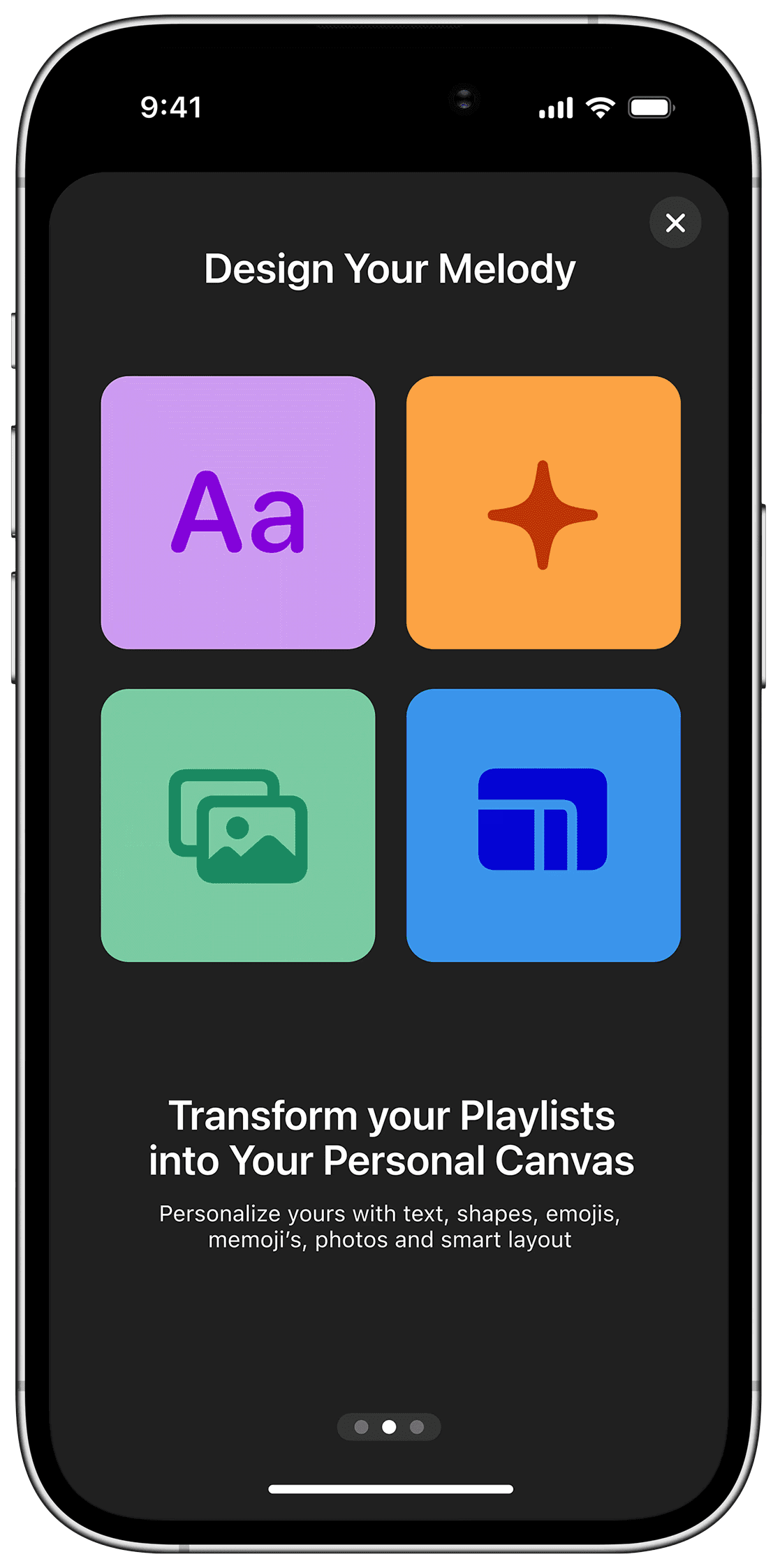
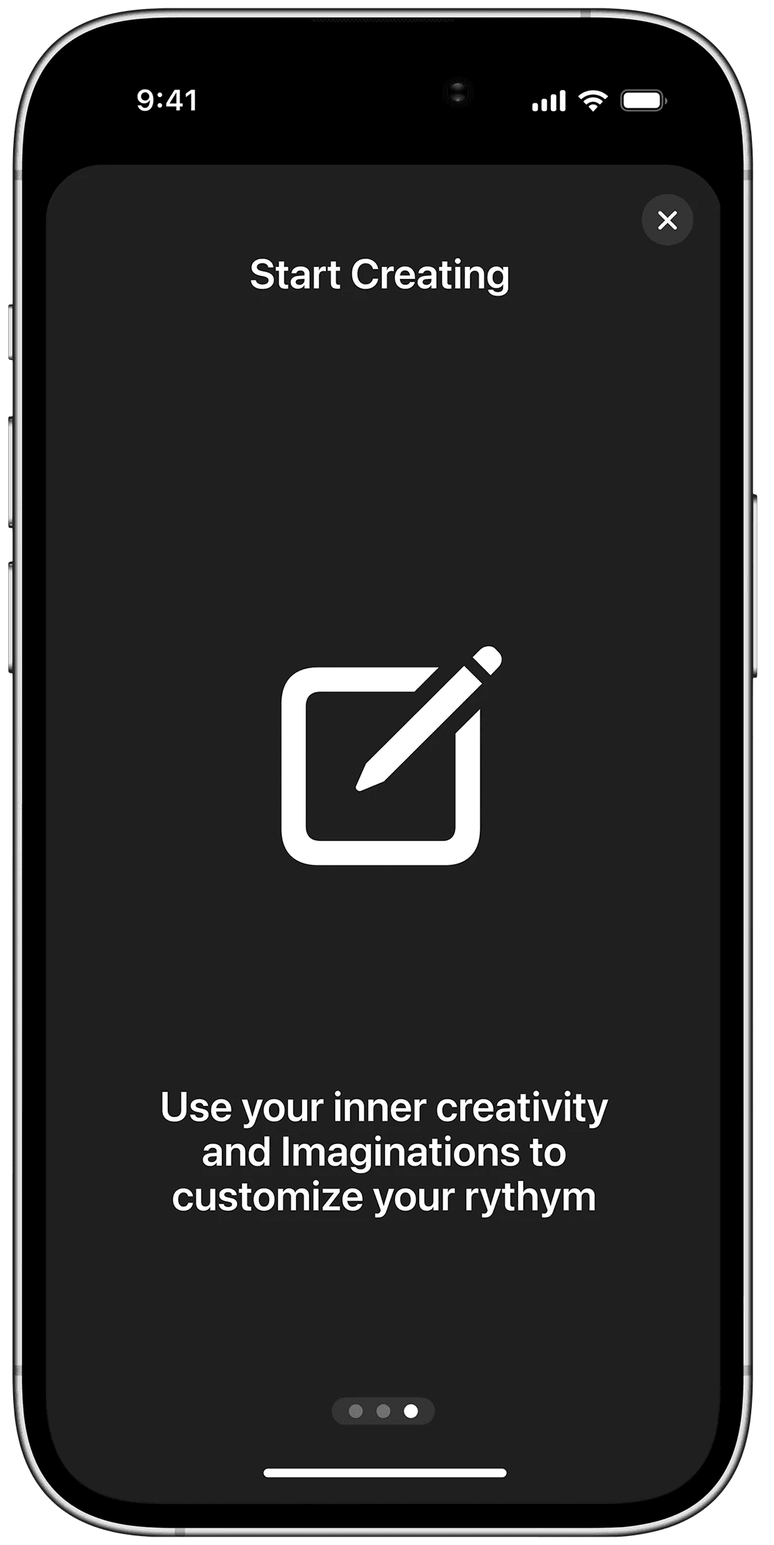
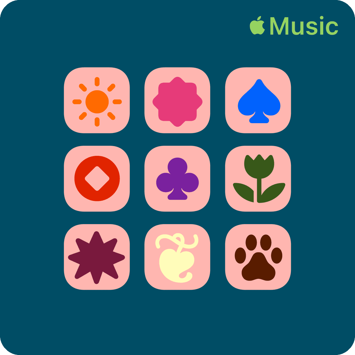
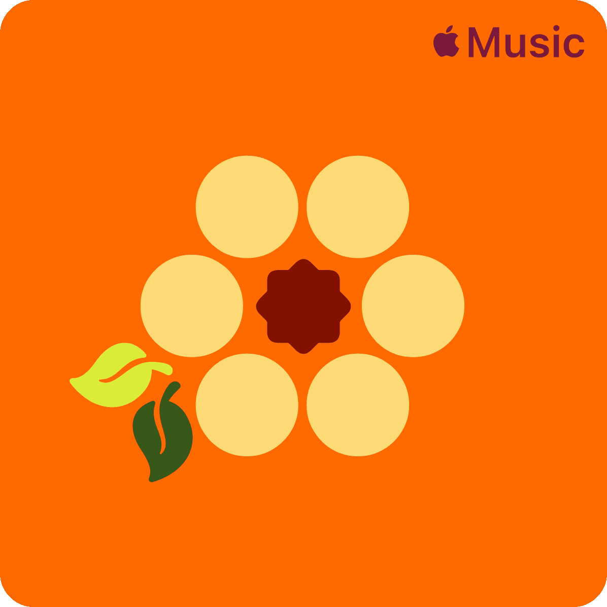
01 Manual customization
For the designers. The perfectionists. Shapes, text, Memojis, Genmoji, photographs. Smart layouts that adapt to your vision. No algorithms. No guesswork. Full control.
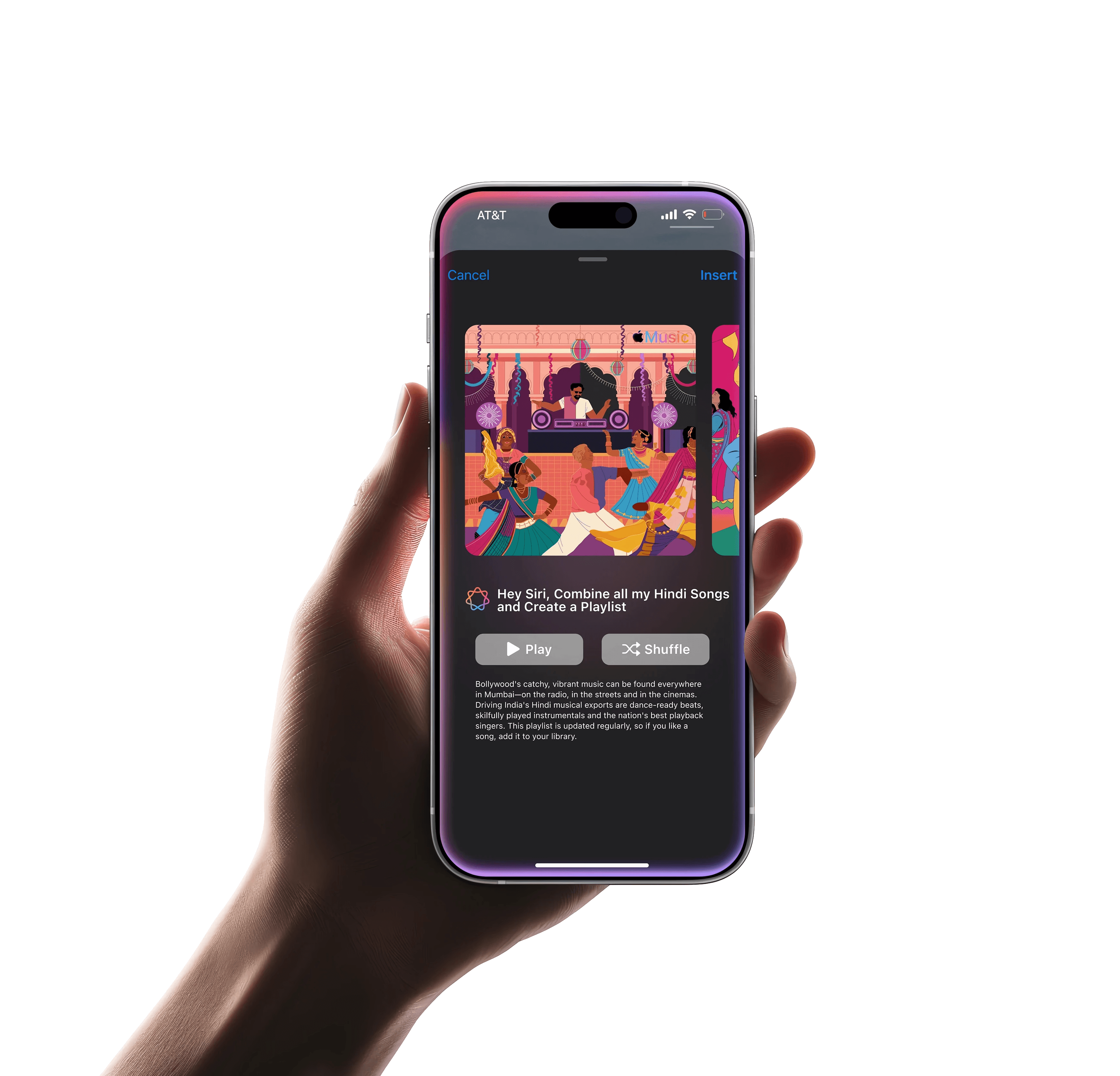
02 Siri integration
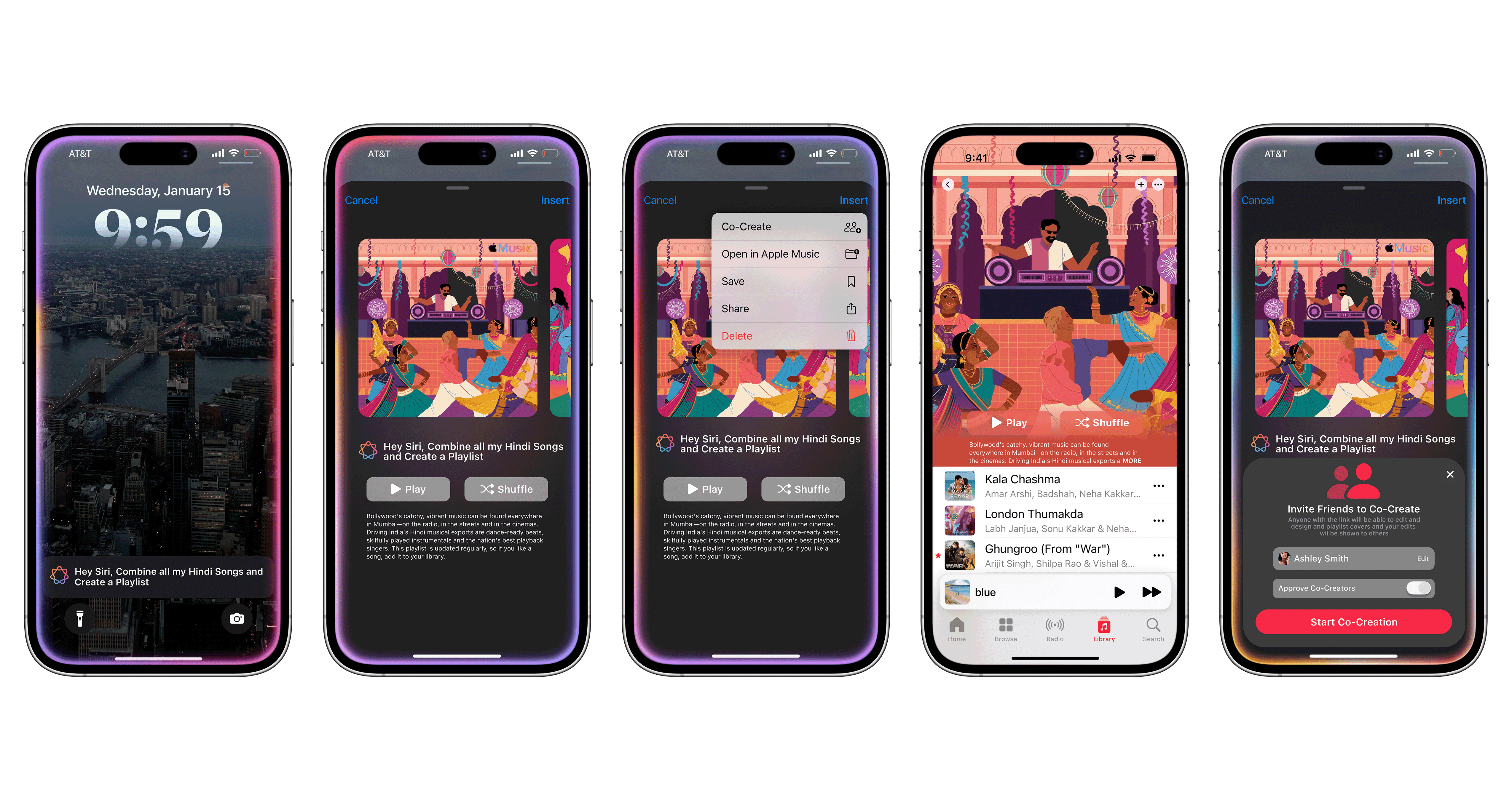
"Hey Siri, create a playlist for all my Bollywood songs." The cover that follows isn't a gradient — it carries the vibrancy, the drama, the culture. AI that recognizes identity, not just genre.
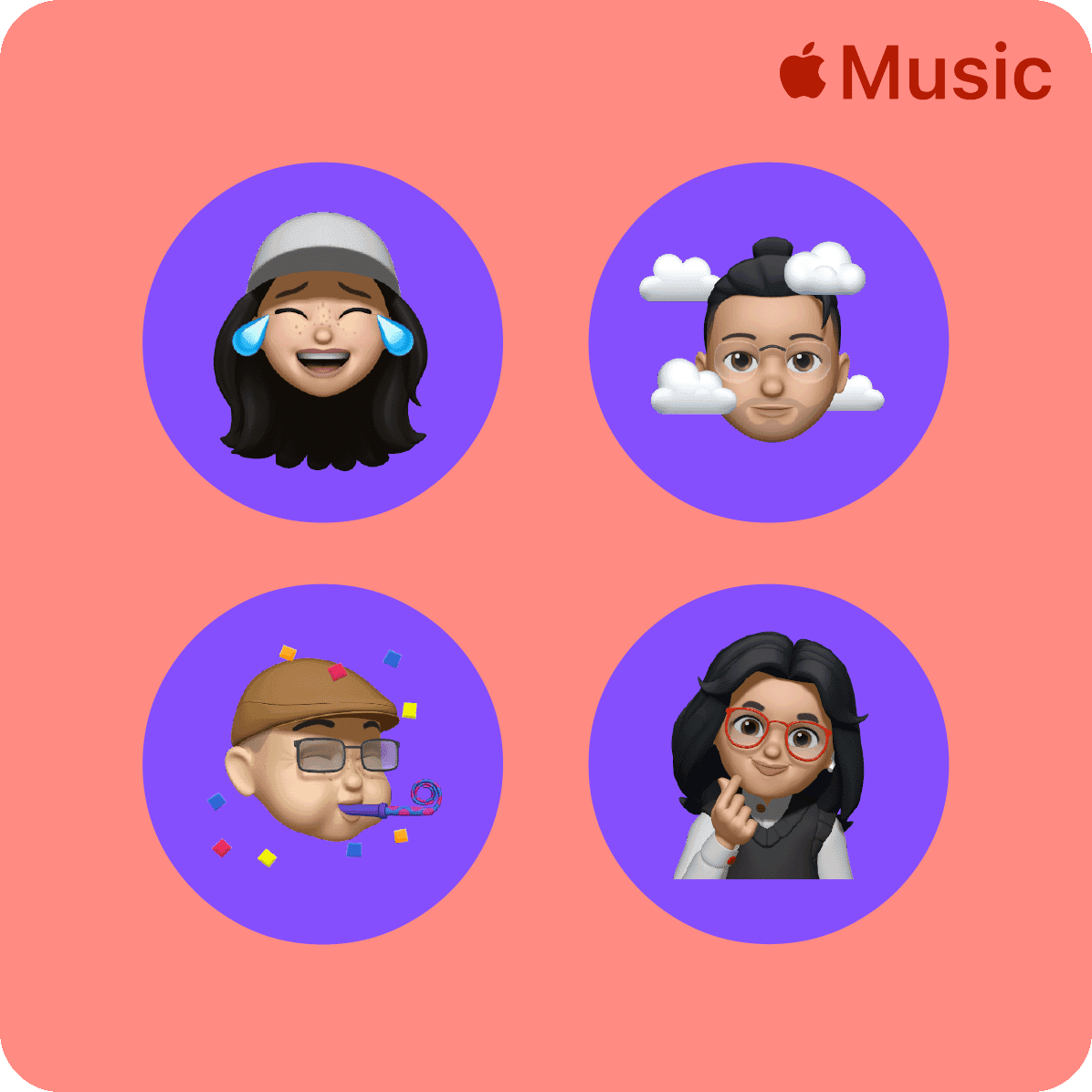
03 Group chat analysis
Your group chat is already curating the vibe. Apple Intelligence reads the conversation, the jokes, the moments, and turns them into collaborative artwork. Your friends. Your story. Visualized.

What users said
01
"I want artwork that feels like the mood of the playlist, not just pulled from one song."
— research participant
02
"I miss having a grid of albums. It felt like the playlist was mine. Now it all looks the same."
— research participant
03
"If Siri could just generate something that actually matched the vibe, I'd use it every time."
— research participant
01
Manual Customization
Before a single pixel was placed, we returned to the source: Apple's Human Interface Guidelines. Clarity. Consistency. Minimalism. Emotional resonance. Every decision was held against these principles.


02
Siri Integration
"Hey Siri, create a playlist for all my Bollywood songs." The cover that follows isn't a gradient, it carries the vibrancy, the drama, the culture. AI that recognizes identity, not just genre.
The experiment
Two questions. One answer, if the right tool existed.
I didn't just design a system. She tested one. Running the same brief through multiple generative AI tools, she asked two things simultaneously:
Can AI match Apple's visual identity? And can it carry the weight of cultural identity, not just content, but meaning?
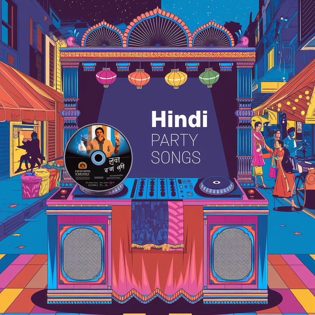
The prompt was consistent across every tool: generate a playlist cover for a Bollywood collection — vibrant, culturally resonant, and unmistakably Apple. The results told very different stories.

The methodology
Same brief. Seven tools. One benchmark.
I held each output against two criteria. First: does it look like Apple made it, the restraint, the palette, the illustrative softness? Second: Does it feel culturally specific? Does a Bollywood cover actually feel Bollywood, or does it just add color and call it done?


The breakthrough
IdeogramAI understood the assignment.
Every other tool gave Vrinda beautiful images. IdeogramAI gave her an Apple image. The illustrative softness, the restrained palette, the way cultural detail was woven in rather than plastered on, it answered both questions at once.
The cover for the Bollywood playlist didn't just look Indian, it felt like Apple had designed something for Indian music. That's the distinction that matters.
This became the proof of concept for Feature 2: Siri Integration. If a voice prompt could trigger IdeogramAI-quality output, culturally aware, visually native, the feature stops being a gimmick and becomes something genuinely useful.
What I proved
Finding 01
Visual identity is learnable.
With precise prompting, AI can internalize Apple's aesthetic, the softness, the restraint, the palette discipline. It isn't accidental. It's trained.
Finding 02
Cultural identity is harder.
Most tools surface culture as decoration, color, pattern, or costume. IdeogramAI went deeper, reflecting mood and meaning, not just motif.
Finding 03
The right tool changes everything.
Tool selection isn't a technical detail; it's a design decision. Vrinda's exploration turned a hypothesis into a working prototype direction.
03
Group chat analysis
Before a single pixel was placed, we returned to the source: Apple's Human Interface Guidelines. Clarity. Consistency. Minimalism. Emotional resonance. Every decision was held against these principles.


Implementation
Apple's AI. Apple's aesthetic.
I tested Image Playground extensively — Apple Intelligence's image generation tool. It produces cohesive color palettes and illustrative styles that feel native to the ecosystem. Not perfectly aligned with Apple Music yet. But the direction is clear.
This hands-on exploration revealed where the technology is, and exactly where it's going.
The big picture
This isn't just a cover generator.
Today
Artwork reflects one song, chosen by default.
With AI
Artwork reflects a feeling, chosen by you, shaped by everything you listen to.
The result
A music library that feels like it knows you. And looks like it, too.
The takeaway
She didn't just prove it could be done.
She proved which tool does it best.
Vrinda's exploration wasn't theoretical. It was hands-on, systematic, and honest about where each tool fell short. The result: a clear recommendation, a validated concept, and a much stronger case for what Apple Music's AI artwork feature could actually look like — in the real world, for real cultures, for real people.
Reflection
What I learned.
The hardest part wasn't the AI. It was making AI feel invisible, like the artwork simply knew. The balance between human control and automated intelligence is delicate, and Apple's aesthetic raises the bar for what "good" looks like.
Next: broader user testing across cultures and contexts, and deeper integration with how Apple Intelligence interprets social signals, not just sonic ones.