BRANDING
Kore
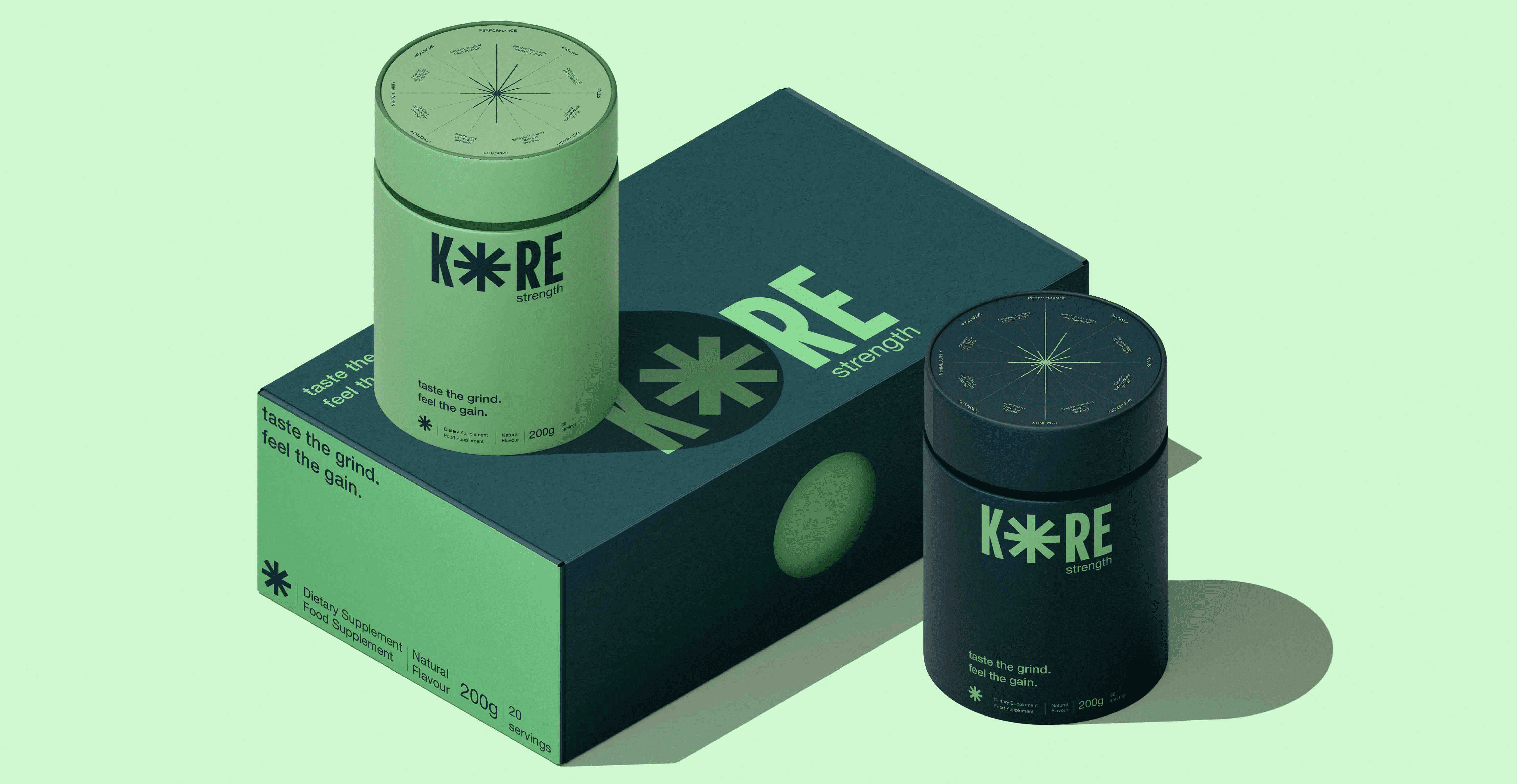
Kore strength, a bold, organic dietary protein supplement designed for professional athletes.
Role
Brand Designer
Timeline
2 weeks
Team
1 designer
Tools
Adobe Illustrator, Photoshop
Mesh is a blockchain-powered P2P payment app that unifies services like Zelle, Venmo, and PayPal into a single, seamless, secure platform. Inspired by Lakshmi, the goddess of wealth, mesh enables money to move freely, fairly, and transparently, without centralized barriers.
P2P payments have become infrastructure, yet the systems underneath them remain fragmented, costly, and siloed. Mesh emerged from a simple observation: people are managing money across four apps instead of one, not because they want to, but because the technology forces it.
The rise of Venmo, Zelle, Cash App, and PayPal gave users unprecedented access to digital payments, but each platform created its own walled garden. A Venmo user can’t send to someone on Zelle without a separate step. A student splitting rent bounces between three apps in a single month. The problem isn’t the willingness to go digital; it’s friction built into the system itself.
Mesh draws on the symbolic power of Lakshmi, the goddess of wealth and abundance, reframing money not as a scarce resource to be gatekept, but as energy meant to flow freely and fairly. This became both a design philosophy and a product mandate.
BRAND IDENTITY
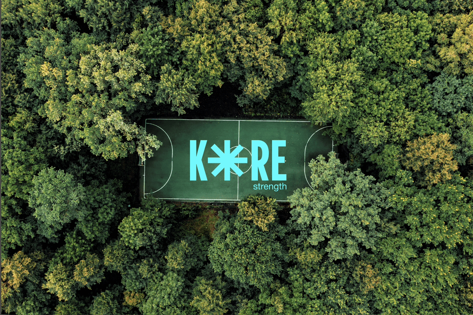
KORE Strength: Clean Fuel. Real Results.
KORE is a performance-driven, plant-based protein built for professional athletes and high-performers. Each blend is powered by organic ingredients like maca, ashwagandha, turmeric, and lion’s mane, designed to support focus, energy, recovery, and gut health. No fillers. No hype. Just clean, adequate fuel that works as hard as you do.
We built KORE’s identity to reflect that same clarity and purpose. The logo is bold and confident, just like the athletes we serve. The icon takes cues from science, modern, minimal, and all about synergy. Every detail, from the packaging to the product info, is designed for transparency. No guesswork. Just what you need, when you need it.
Taste the grind. Feel the gain. KORE makes training smarter, recovering faster, and staying locked in simple.
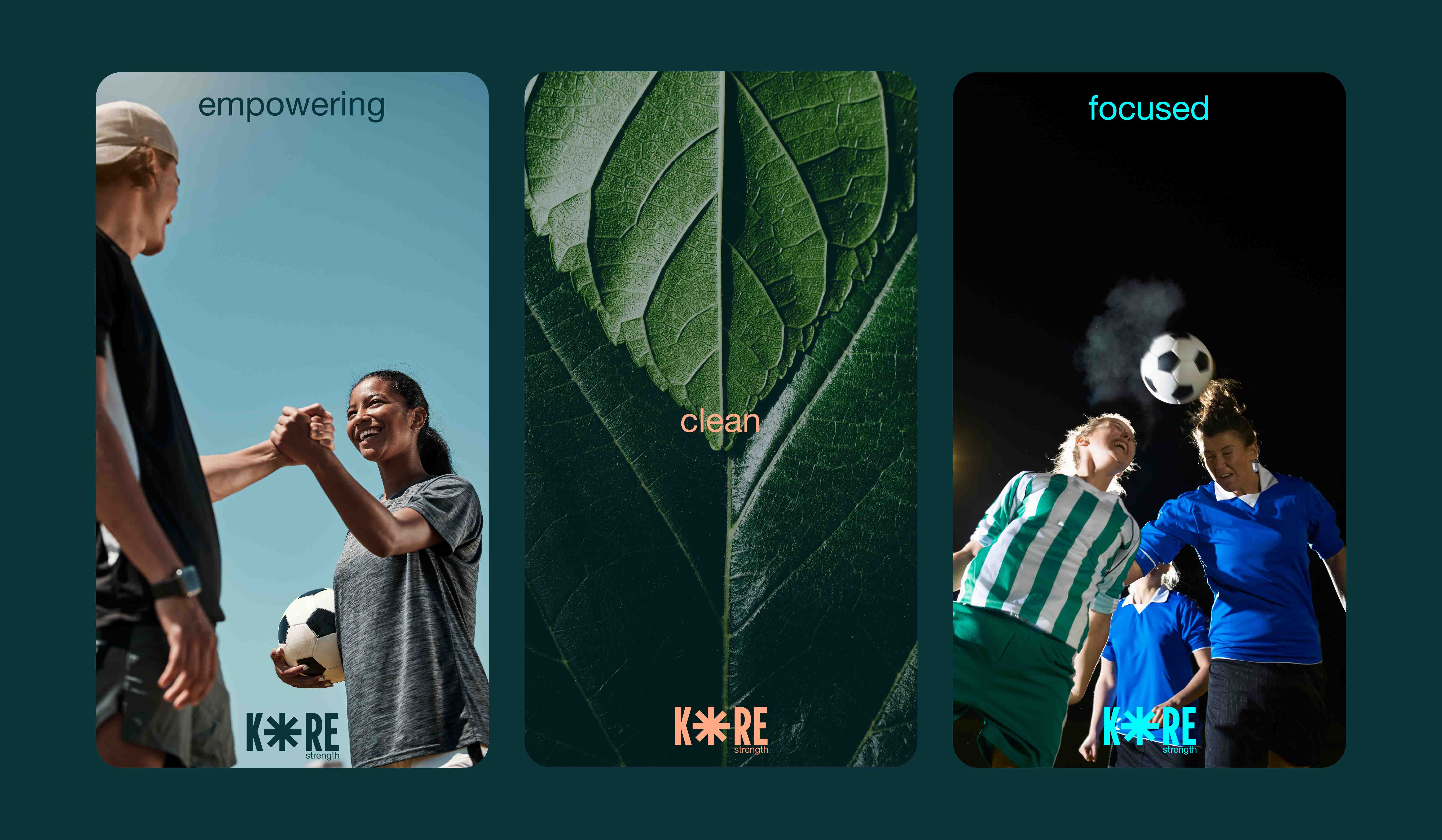
KORE has a bold, empowering tone of voice rooted in performance, authenticity, and clarity. It speaks directly to athletes and high-performers with confidence, never arrogant, always purposeful. The language is raw but refined, grounded in science yet accessible, and designed to motivate without the hype. KORE doesn’t just sell protein; it delivers fuel for both body and mind, with a clean, unfiltered voice committed to helping you unlock your inner strength. We crafted a brand identity that speaks with clarity and confidence: infographics that break down exactly what’s inside, a clean and adaptable typographic system built for transparency that reflects a lifestyle brand that practices what it preaches.

The clarity you see benefits you can feel
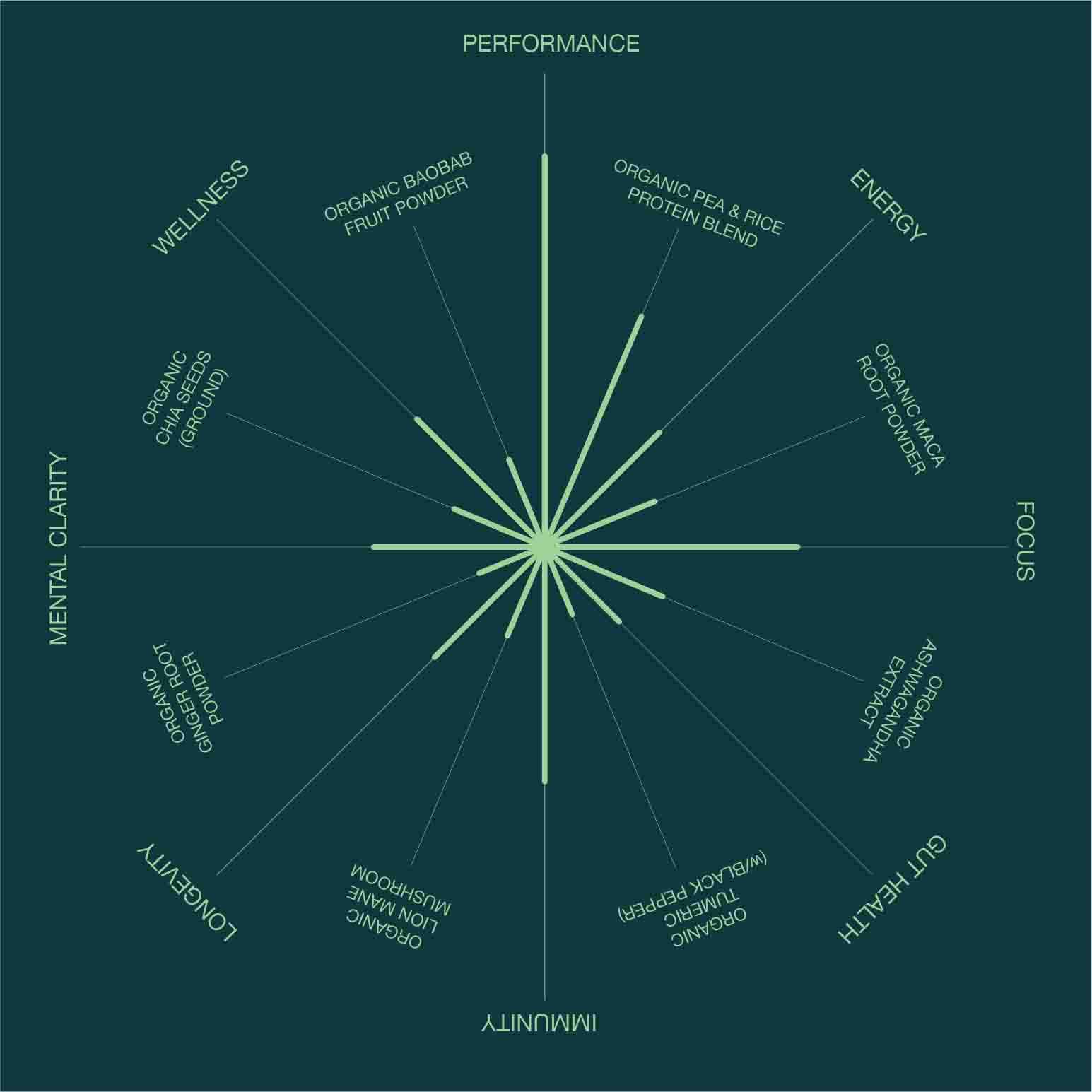
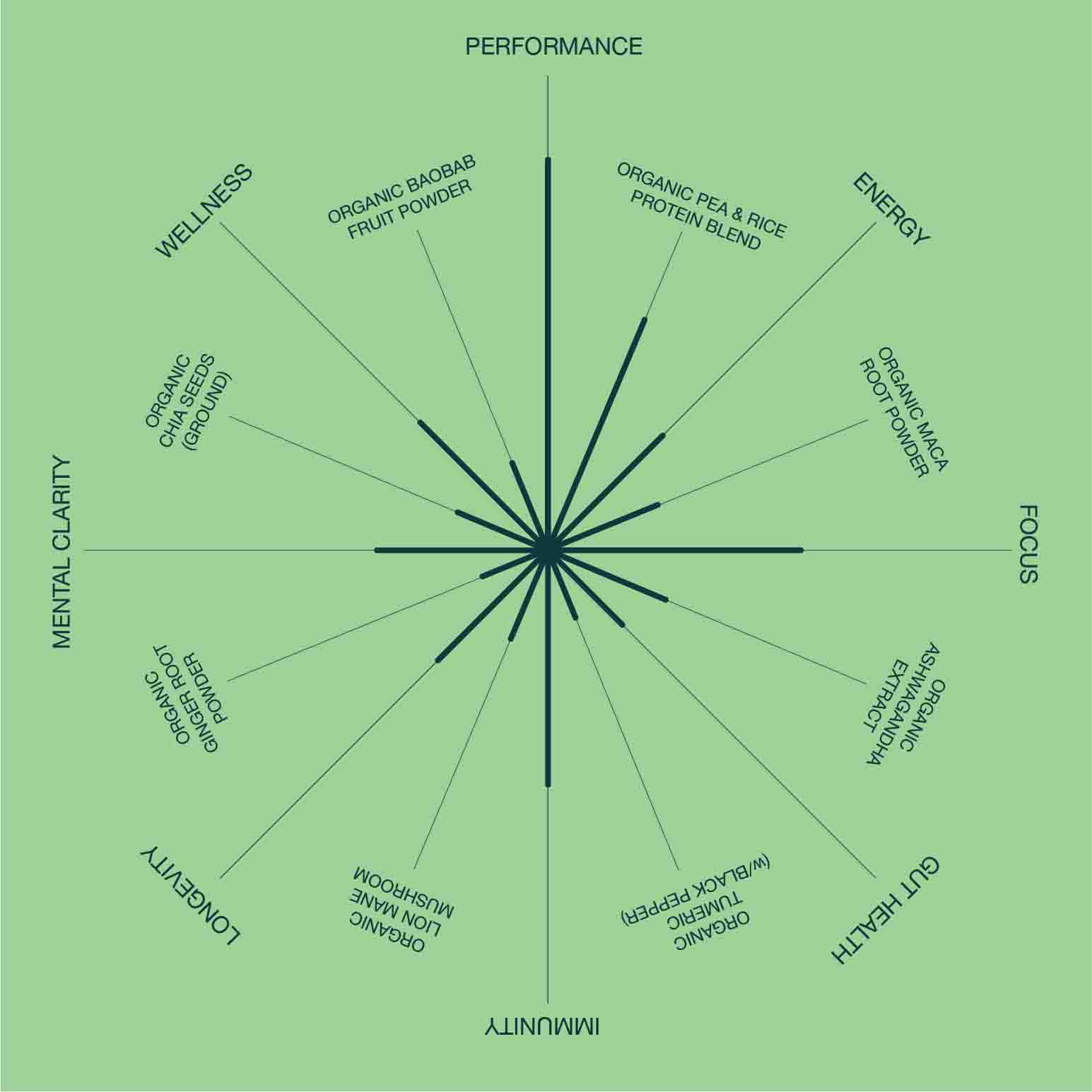
At KORE, transparency isn’t just a value; it’s built into the design. Our ingredient breakdown uses a clean radial chart that shows exactly how each organic component powers your performance. From pea and rice protein for strength to maca and ashwagandha for focus and recovery, every spoke connects a natural ingredient to a functional benefit, energy, gut health, immunity, and beyond.
No fluff, no noise, just a straight-up visual of what’s inside and what it does. Whether you're scanning for cognitive boosters like lion’s mane or immunity support from turmeric and black pepper, the chart keeps it simple, fast, and athlete-first. This is how KORE keeps you informed, empowered, and always one step ahead.
Logo & icon
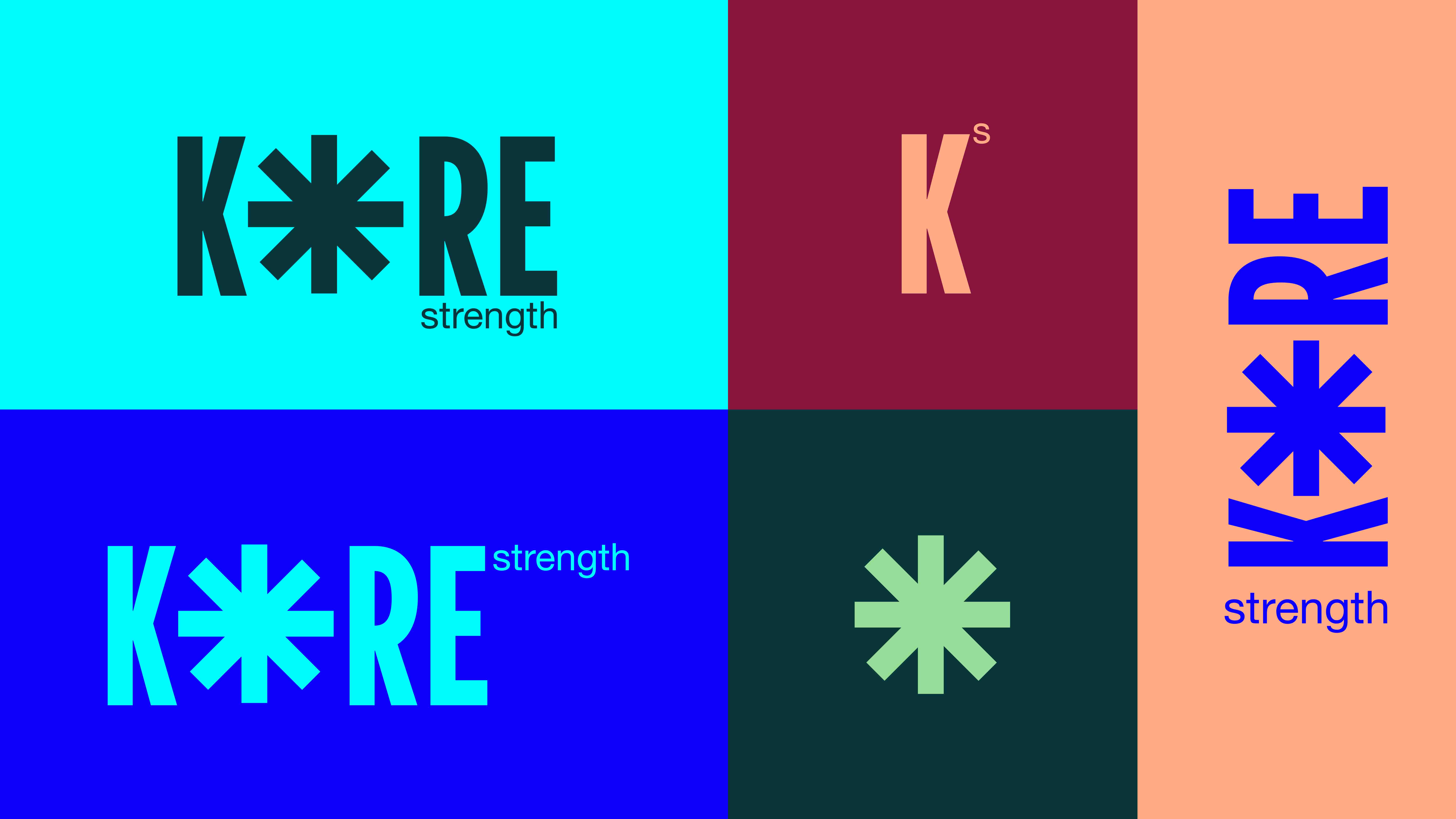
The KORE logo is bold and reflects the strength and clarity at the brand's heart. It comes in two distinct versions: one for the core formula and one for the enriched performance blend. The brand icon draws inspiration from chemistry and physics—designed as a modern “molecule” symbolizing the synergy between science, strength, and everyday athleticism.
Flavours
Flavours
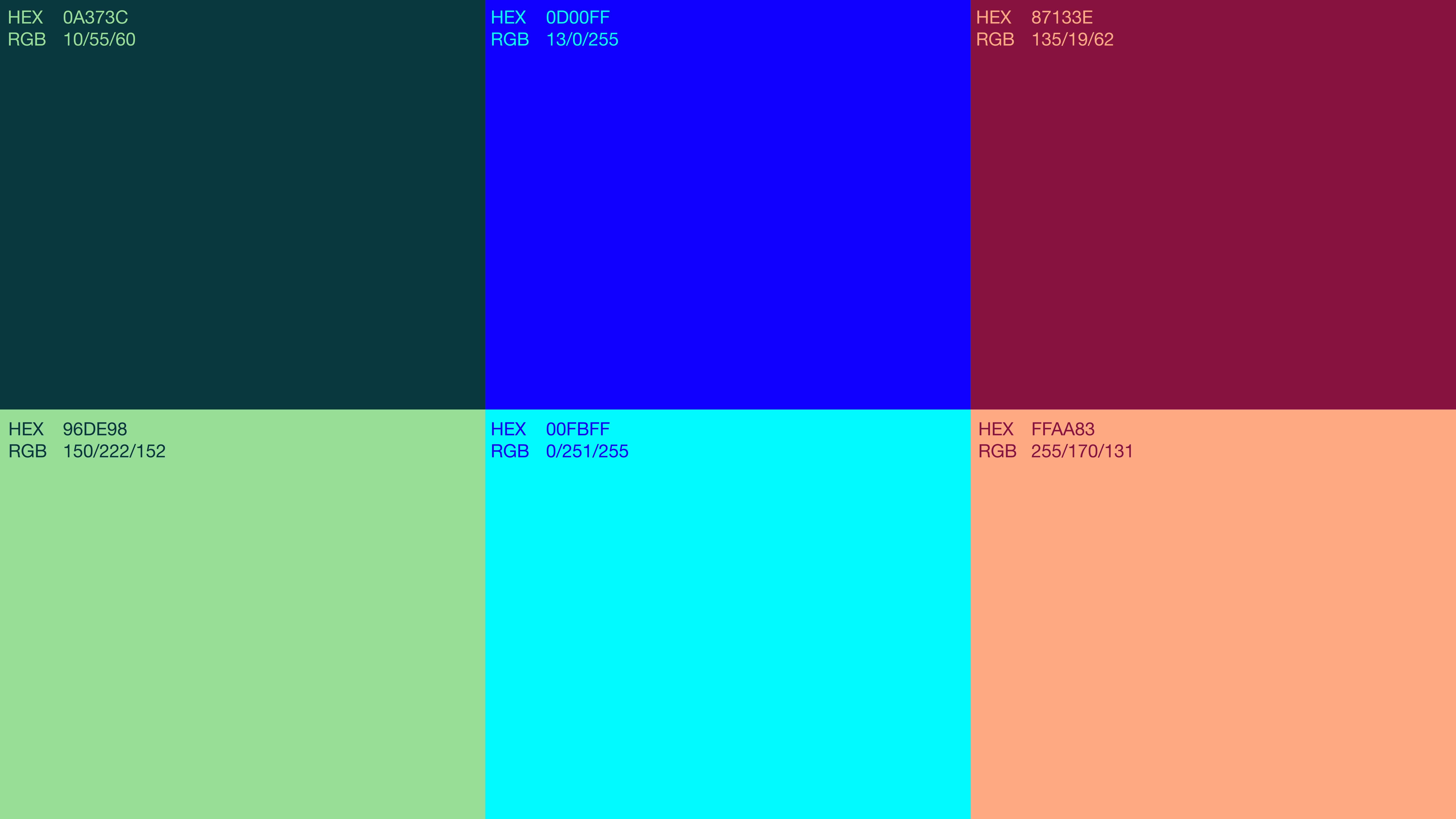
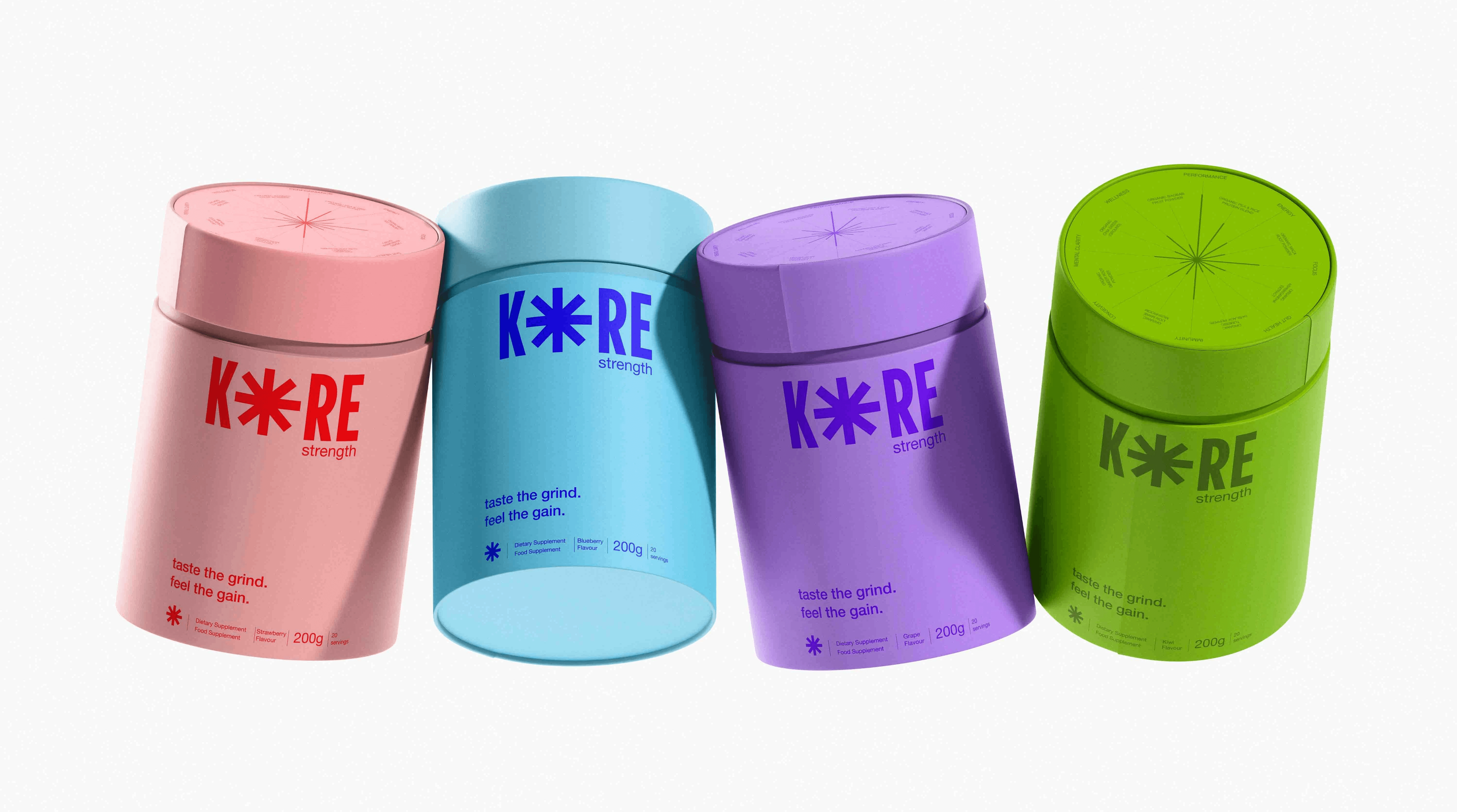
KORE Strength doesn’t just power performance, it brings bold flavor to the grind. Each variant, Strawberry, Banana, Blueberry, and Kiwi, is crafted with natural flavor and a vibrant personality of its own. To reflect that, I designed packaging that’s as dynamic as the product inside. Bold, contrasting colors clearly distinguish each flavor while staying true to the brand’s confident, clean aesthetic. It’s not just eye-catching, it’s a functional design that helps athletes quickly grab their favorite fuel and get back to pushing limits. Flavor meets function, without compromise.
Reflection
What worked
↑ Cultural grounding created differentiation
Anchoring the brand in Lakshmi wasn't cosmetic; it gave every design decision a filter. When in doubt: does this feel like abundance or scarcity? That question shaped copy, color, and UX flow.
↑ Interviews surfaced the real insight
The blockchain-as-invisible finding wasn't in my initial hypothesis. It came entirely from listening. That reframe, from "educate users about blockchain" to "make blockchain outcomes visible, not the mechanism", changed the entire onboarding design.
↑ Direct research → feature mapping
Forcing every feature to trace back to a named user pain kept scope tight and made design rationale easy to articulate.
What I'd change
→ Deeper technical feasibility research
The cross-platform OAuth integration is directionally sound but would require significant legal and partnership work in reality. I'd pressure-test the API layer earlier in a longer engagement.
→ More diverse participant pool
My 6 interviewees skewed young and NYC-based. Remittance use cases, older demographics, and underbanked users would have introduced important edge cases and opened up a larger addressable market.
→ Usability testing at lower fidelity
I moved to hi-fi too quickly. Earlier lo-fi testing would have caught the information architecture issues I spotted in iteration — saving design time.
If this shipped
Phase 2: Smart Rules
Expand smart contract capabilities to include recurring bills, bill splitting with automatic pro-rata calculation, and threshold-based transfers (pay when balance drops below X).
If this shipped
Phase 3: Groups
Multi-person payment groups with shared ledgers and split history, turning Mesh into the coordination layer for households, roommates, and recurring social expenses.
Long-term
Institutional Rail
Extend the interoperability layer to small business payroll and contractor payments; the same fragmentation problem exists at higher stakes in the SMB space.
"The best fintech design doesn't make people think about money, it makes money move the way people think."