
Mesh
Role: UX Research, Design, Interviews, Product Design, Prototyping,
Branding & Visual Identity
Tools: Figma
Focus: Fintech, payment flows
Year: 2025
Mesh is a blockchain-powered P2P payment app that unifies services like Zelle, Venmo, and PayPal into a single, seamless, secure platform. Inspired by Lakshmi, the goddess of wealth, mesh enables money to move freely, fairly, and transparently, without centralized barriers.
P2P payments have become infrastructure, yet the systems underneath them remain fragmented, costly, and siloed. Mesh emerged from a simple observation: people are managing money across four apps instead of one, not because they want to, but because the technology forces it.
The rise of Venmo, Zelle, Cash App, and PayPal gave users unprecedented access to digital payments, but each platform created its own walled garden. A Venmo user can't send to someone on Zelle without a separate step. A student splitting rent bounces between three apps in a single month. The problem isn't the willingness to go digital; it's friction built into the system itself.
Mesh draws on the symbolic power of Lakshmi, the goddess of wealth and abundance, reframing money not as a scarce resource to be gatekept, but as energy meant to flow freely and fairly. This became both a design philosophy and a product mandate.
$1.2T
P2P transaction volume (US, 2024)
4.1
Avg. payment apps per US adult
67%
Users who experience transfer friction monthly
$3-5
Hidden fee range per instant transfer


Background
The core problem isn't any single app failing; it's the absence of a connective layer between them. Users have to maintain parallel identities, balances, and contact lists across platforms that share no data.
"I just sent $40 to the wrong person because they're on Cash App and I was using Venmo. There's no undo."
-recurring theme across user interviews


How might we?
The core problem isn't any single app failing; it's the absence of a connective layer between them. Users have to maintain parallel identities, balances, and contact lists across platforms that share no data.
01
Reduce the need for multiple P2P apps and centralize payments in one place?
02
Leverage blockchain to provide fee transparency and trustless exchange without requiring technical literacy?
03
Design a financial product that feels abundant and empowering rather than bureaucratic?

Solution preview
Mesh unifies P2P payment platforms under a single decentralized interface, one identity, one balance view, one place to send and receive from anyone, regardless of their home platform.


(Unified Payments Layer)
Mesh brings together multiple payment systems (like Zelle, Venmo, PayPal, and crypto wallets) into a single interface.
→ You don’t think about how to send money, just send it.
(Blockchain-Powered Infrastructure)
Instead of relying purely on centralized systems, Mesh uses blockchain rails to enable transparency, security and reduced dependency on intermediaries.
(Send without thinking)
Type an amount. Choose a name. Done.
Mesh handles the route behind the scenes.
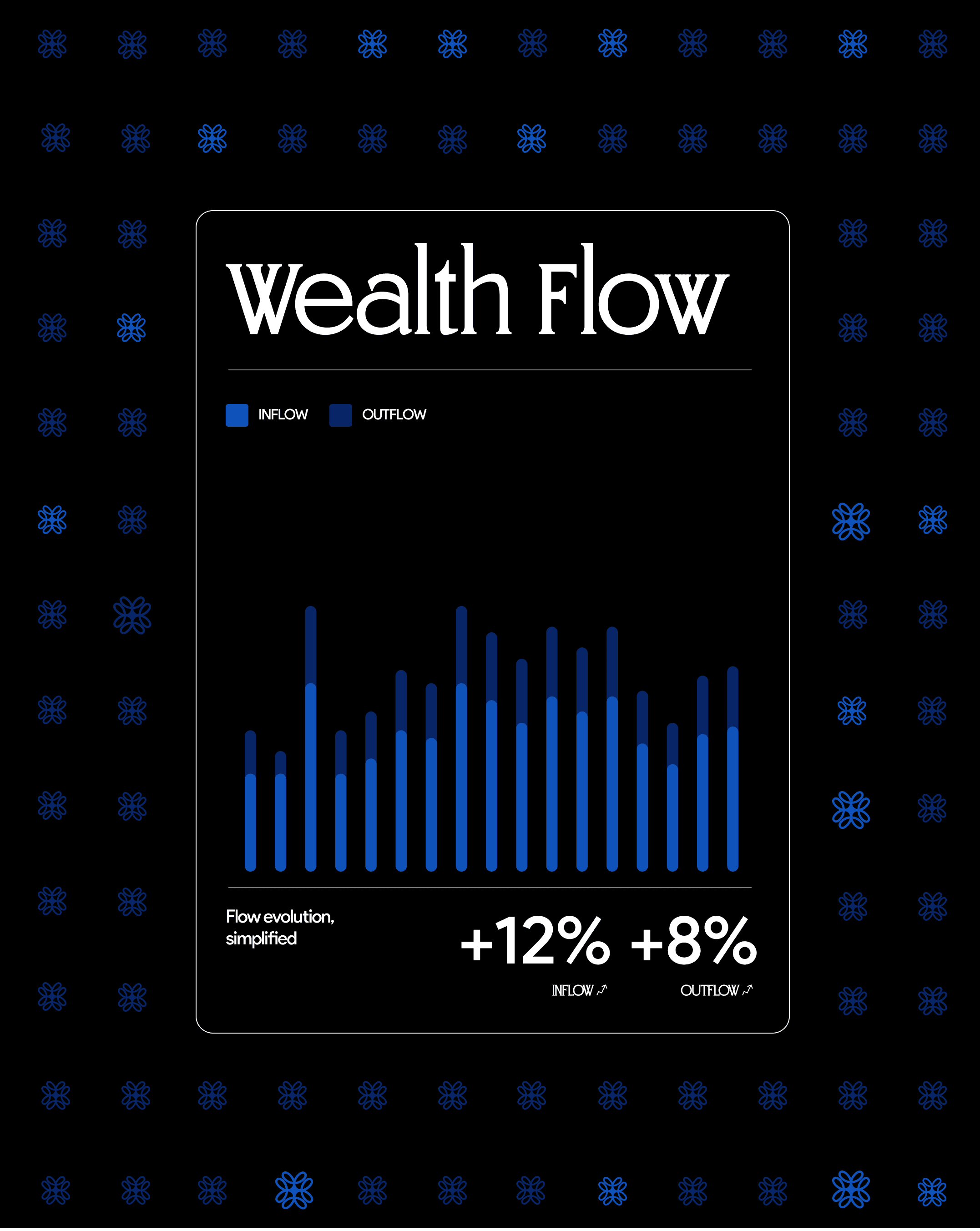
(See your wealth flow)
Track movement, not just balances.
Understand where your money is, and where it’s going.
Competitive analysis
The P2P payment landscape is crowded but not coherent. Each player optimizes for a vertical, social, bank-native, crypto, leaving the connective layer unoccupied.


User Interviews
Six qualitative interviews with US-based users aged 19–32, students, early-career professionals, and gig workers, surfaced patterns around frustration, workarounds, and unmet expectations.
"Maya, 22: Graduate Student, NYC Apps used: Venmo, CashApp, Zelle Freq: 8-12 transfers/month Pain: Roommates on different apps"

Maya Kluger
Mobile banking app user
"I didn't know Venmo charged me until I checked my bank statement. It said 'instant transfer,' but it took 1.5%? That felt like a trick."

Jonathan Lemon
Mobile banking app user Pain Point
"I have three different apps, and none of my friends use the same one. I'm basically the payment, coordinator for every group expense."
Jonathan Lemon
Mobile banking app user Pain Point
"I'd love to say, 'pay my share automatically when the bill comes, like, set up a rule. None of these apps do that."

Dave S.
Mobile banking app user Unmet Need
"Blockchain sounds complicated, but if it means no fees and it just works, I don't care how it works. Just make it invisible."
Dave S.
Mobile banking app user Key Insight
"I'd switch in a second if it meant I only had to open one app. The switching is the annoying part, not the payment itself."
Anna Kluger
Mobile banking app user Switching Intent

Solution integration
Research and problem framing drove every design decision. The integration layer shows how user needs are mapped directly to product features, and how Lakshmi's symbolic values shaped the UX tone throughout.
01
Fully Responsive
Connect
Link existing Venmo, Zelle, PayPal, Cash App accounts via OAuth. One-time setup, persistent sync.
02
02
02
02
02
02
02
02
02
Mesh Layer
Unified identity + blockchain routing. Mesh resolves which network delivers best outcome for each transfer.
03
No-Code Customization
Send
Single send flow with full fee preview, delivery estimate, and recipient platform shown before confirmation.
04
Built for Framer
Verify
Transaction recorded on-chain. Immutable receipt generated. Both parties see the confirmed status instantly.
SEO & Performance Ready
Optimized for fast loading, clean structure, and better visibility in search results.
05
SEO & Performance Ready
Analyze
Cross-platform transaction history aggregated into a single timeline. Smart insights surfaced over time.

Design decisions
01
Research → Feature
Every core feature maps to a named user pain point. Universal wallet came from "app overload." Fee preview came from "surprise charges." Smart contracts came from "I want rules." No feature existed without a user need.
02
Blockchain → Invisible
Users said they want the outcome of blockchain (certainty, low fees), not the experience of it. Mesh surfaces "verified on-chain" as a trust signal, not a technical explanation. The blockchain is the engine, not the dashboard.
03
Lakshmi → Tone
The goddess of abundance became a design constraint: money should feel like it flows, not gets gatekept. This drove the visual language, warm golds, generous spacing, and language that empowers rather than disclaims.

Brand → UX Principles
Flow freely
Remove every unnecessary tap and confirmation. Payments should feel like gestures.
Operate fairly
All fees are visible before they're charged. No dark patterns in confirmation flows.
Move transparently
Transaction status is always visible. Blockchain verification surfaced as confirmation.

(reflections)
Six weeks moved fast. What I built is a design foundation, not a finished product. Here's what I learned, what I'd do differently, and where Mesh goes next.
What worked
↑ Cultural grounding created differentiation
Anchoring the brand in Lakshmi wasn't cosmetic; it gave every design decision a filter. When in doubt: does this feel like abundance or scarcity? That question shaped copy, color, and UX flow.
↑ Interviews surfaced the real insight
The blockchain-as-invisible finding wasn't in my initial hypothesis. It came entirely from listening. That reframe, from "educate users about blockchain" to "make blockchain outcomes visible, not the mechanism", changed the entire onboarding design.
↑ Direct research → feature mapping
Forcing every feature to trace back to a named user pain kept scope tight and made design rationale easy to articulate.
What I'd change
→ Deeper technical feasibility research
The cross-platform OAuth integration is directionally sound but would require significant legal and partnership work in reality. I'd pressure-test the API layer earlier in a longer engagement.
→ More diverse participant pool
My 6 interviewees skewed young and NYC-based. Remittance use cases, older demographics, and underbanked users would have introduced important edge cases and opened up a larger addressable market.
→ Usability testing at lower fidelity
I moved to hi-fi too quickly. Earlier lo-fi testing would have caught the information architecture issues I spotted in iteration — saving design time.
If this shipped
Phase 2: Smart Rules
Expand smart contract capabilities to include recurring bills, bill splitting with automatic pro-rata calculation, and threshold-based transfers (pay when balance drops below X).
If this shipped
Phase 3: Groups
Multi-person payment groups with shared ledgers and split history, turning Mesh into the coordination layer for households, roommates, and recurring social expenses.
Long-term
Institutional Rail
Extend the interoperability layer to small business payroll and contractor payments; the same fragmentation problem exists at higher stakes in the SMB space.
"The best fintech design doesn't make people think about money, it makes money move the way people think."