Back
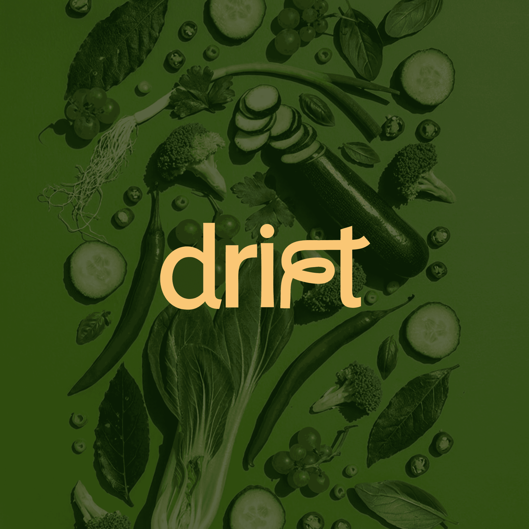
Drift (ongoing)
Role: Product Designer, UX Researcher, Brand designer
Tools: Figma, Adobe Illustrator & Photoshop
Year: 2026
A personalized nutrition OS that turns food decisions into guided, health-aware action.
Drift is a personalized nutrition platform that removes decision fatigue from eating well. Built for users managing goals like muscle gain, weight loss, PCOS, hypertension, plant-based eating, GLP-1 medication routines, allergies, and macro targets, the app transforms nutrition from a manual tracking habit into a guided daily system.
The experience centers around one simple behavior: Drift recommends what to eat based on where the user is in their day. If someone is short on protein, avoiding gluten, managing blood sugar, or trying to stay within a calorie target, Drift surfaces the right meal, recipe, or restaurant order without making them do the math.
The product also introduces Drift Pass, a partner restaurant network where menus are macro-verified and matched to user goals. This makes Drift more than a nutrition app. It becomes a bridge between users and restaurants: users get health-aware food guidance, while restaurants gain access to customers who already know what they want to order.
Visual Identity + Branding Description
Drift’s identity system is built around the idea that nutrition is personal, but not always photographic or literal. Instead of using generic food icons or fitness clichés, the brand uses abstract shapes and color combinations to create a unique identity layer for every user.
The system works on two axes:
Shape = behavior, personality, or goal
Color = health category or nutritional context
Together, they create a flexible visual language that can represent different user types without relying on profile photos, avatars, or overly medical imagery.
Brand System
The visual identity is warm, structured, and personal. It avoids the sterile feeling of clinical health apps and the hyper-optimized look of fitness trackers. Instead, Drift feels like a premium wellness system with enough intelligence to be trusted and enough softness to feel human.

Primary, Secondary & Tertiary Colors
The shape system gives Drift a distinctive brand asset beyond color.

Shape Language
The shape system gives Drift a distinctive brand asset beyond color.

Combining the visual shape language and color system
The shape system gives Drift a distinctive brand asset beyond color.

More coming soon
More Projects