BRANDING
Sunblock
Kore strength, a bold, organic dietary protein supplement designed for professional athletes.
Role
Brand Designer
Timeline
2 weeks
Team
1 designer
Tools
Blender, Adobe Illustrator, Figma
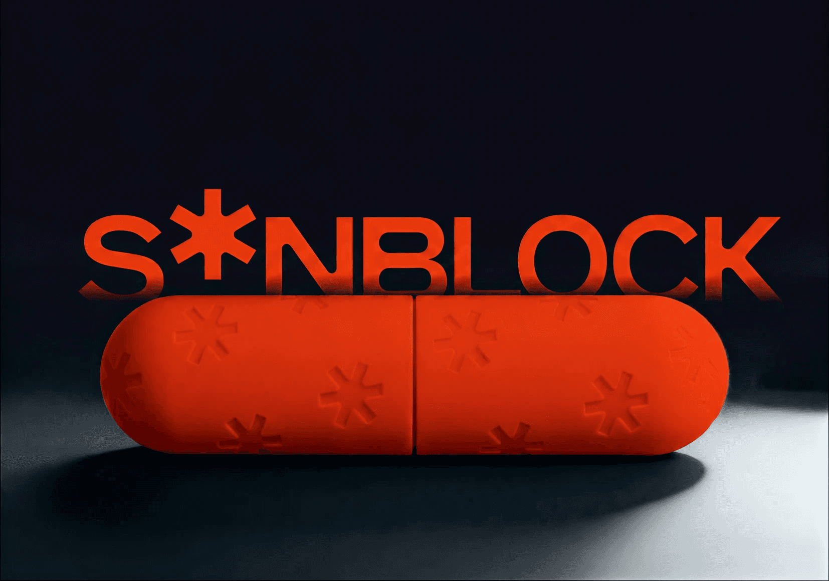
Sunblock is a bold outdoor skincare concept built around the idea of sun protection as both utility and visual signal. Designed for hikers, skiers, climbers, and high-altitude environments, the brand turns sunscreen from a quiet product into a vivid, gear-like object.
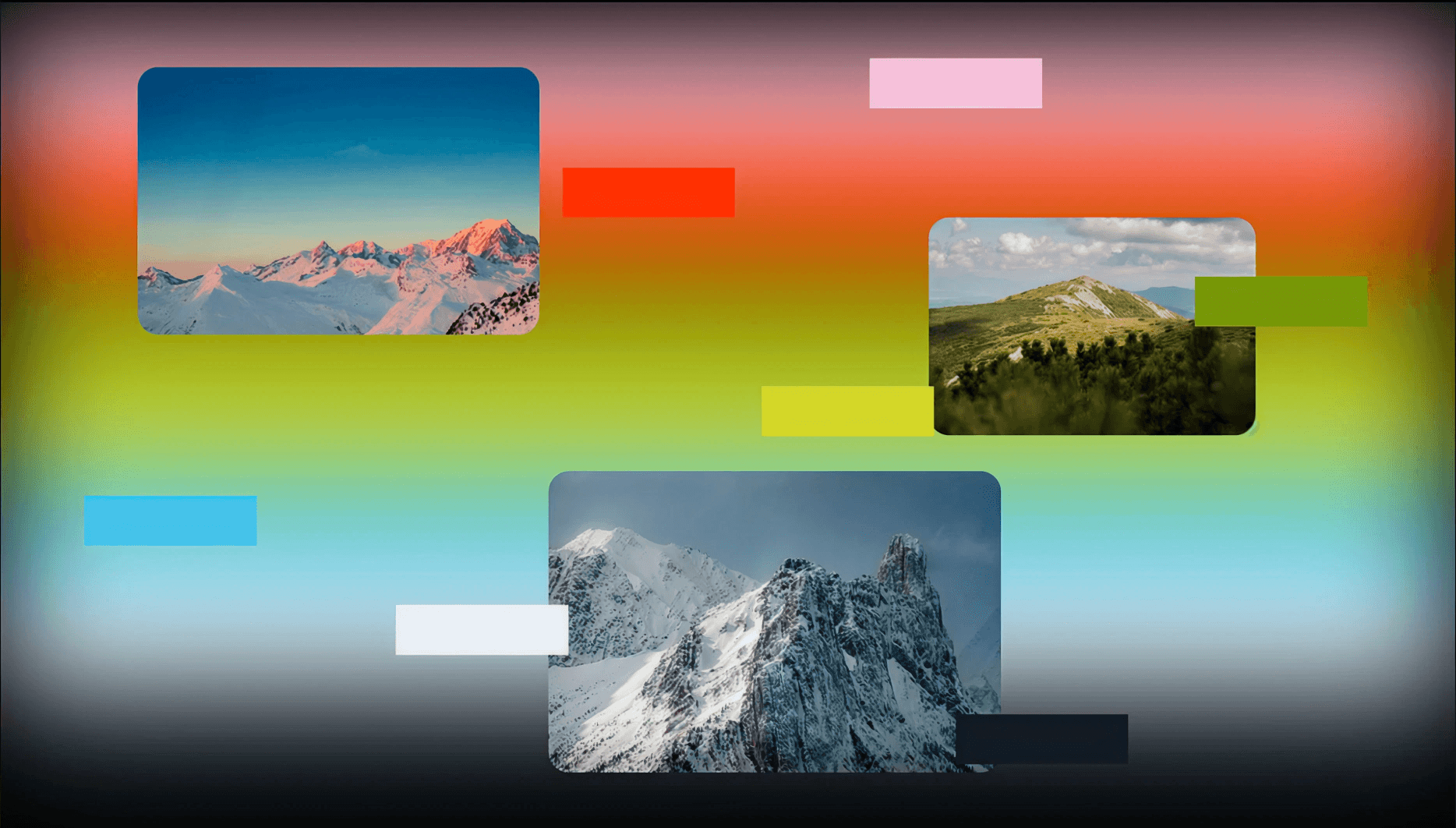
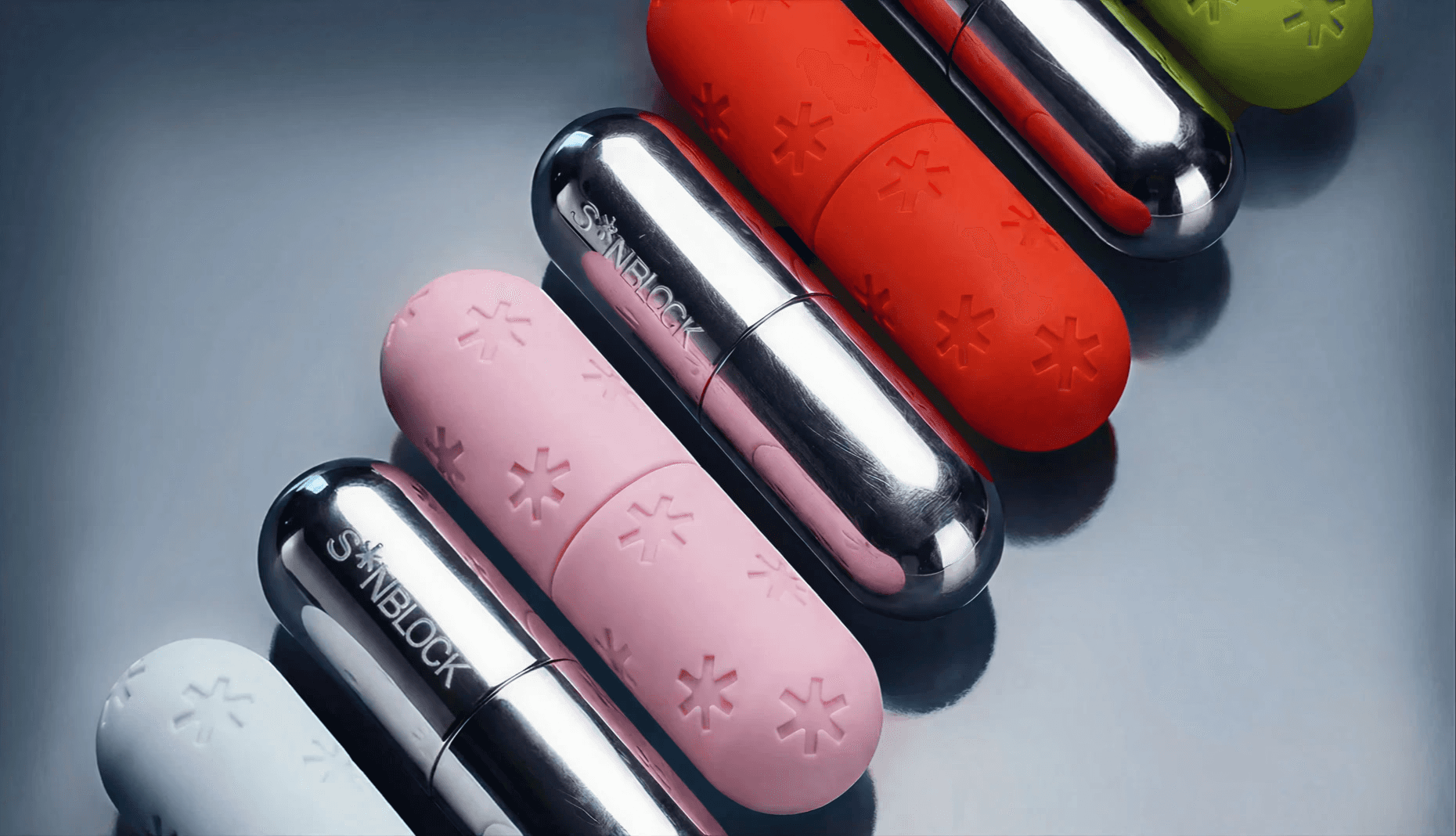
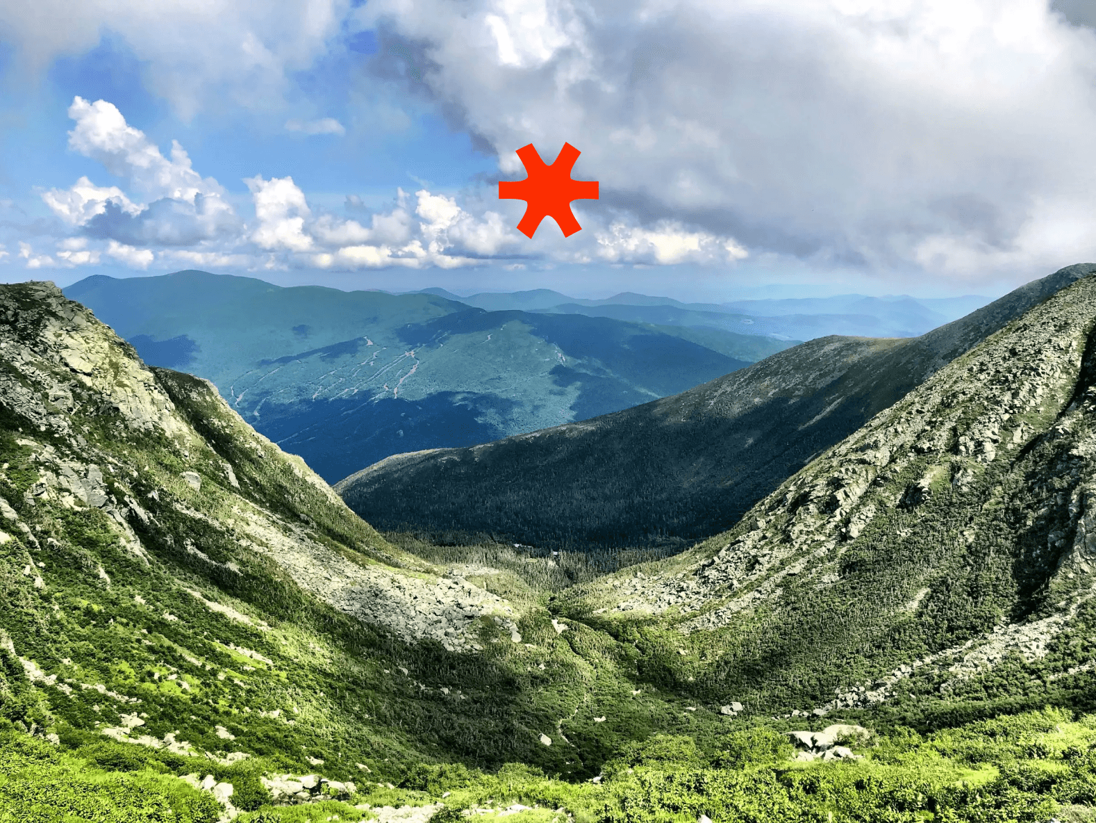
The identity uses a strong capsule form, metallic finishes, and a punchy asterisk symbol that functions like both a sun mark and a warning icon. Bright red, soft pink, icy blue, and acid green create a system that feels protective, energetic, and slightly futuristic. The visuals combine alpine landscapes, thermal gradients, chrome packaging, and embossed surface details to position Sunblock as performance skincare with a high-design edge.
Rather than feeling clinical or lifestyle-soft, Sunblock feels engineered for exposure: reflective, tactile, portable, and unmistakable in the wild.
BRAND IDENTITY
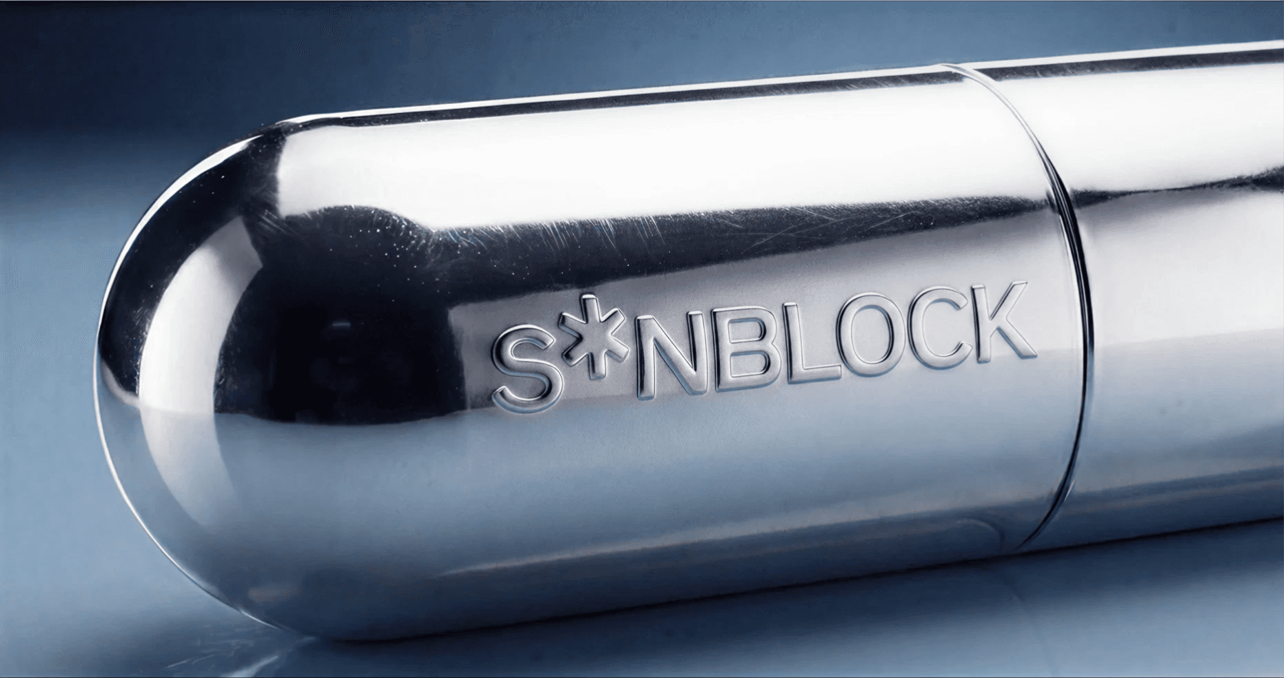
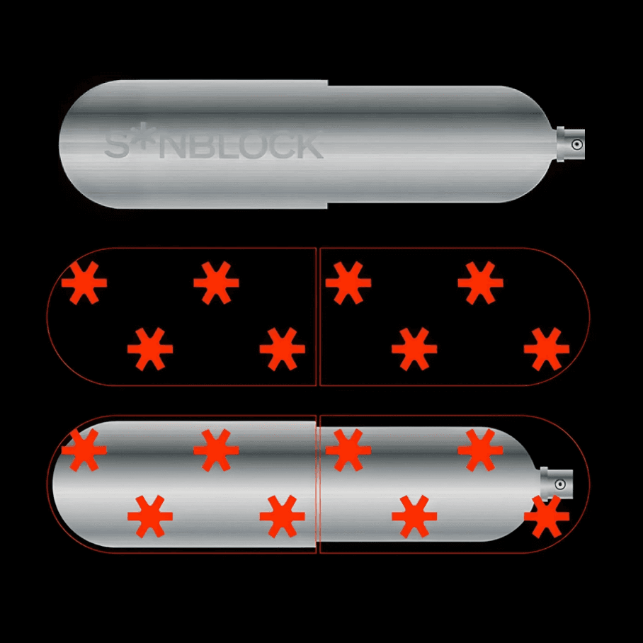
Logo & icon
Reflection